01
Toronto Spine
Toronto Spine

Client
Client
Toronto Spine
Toronto Spine
Type
Type
Brand Identity
Brand Identity
,
,
Digital Experience
Digital Experience
Year
Year
2025
2025
About
About
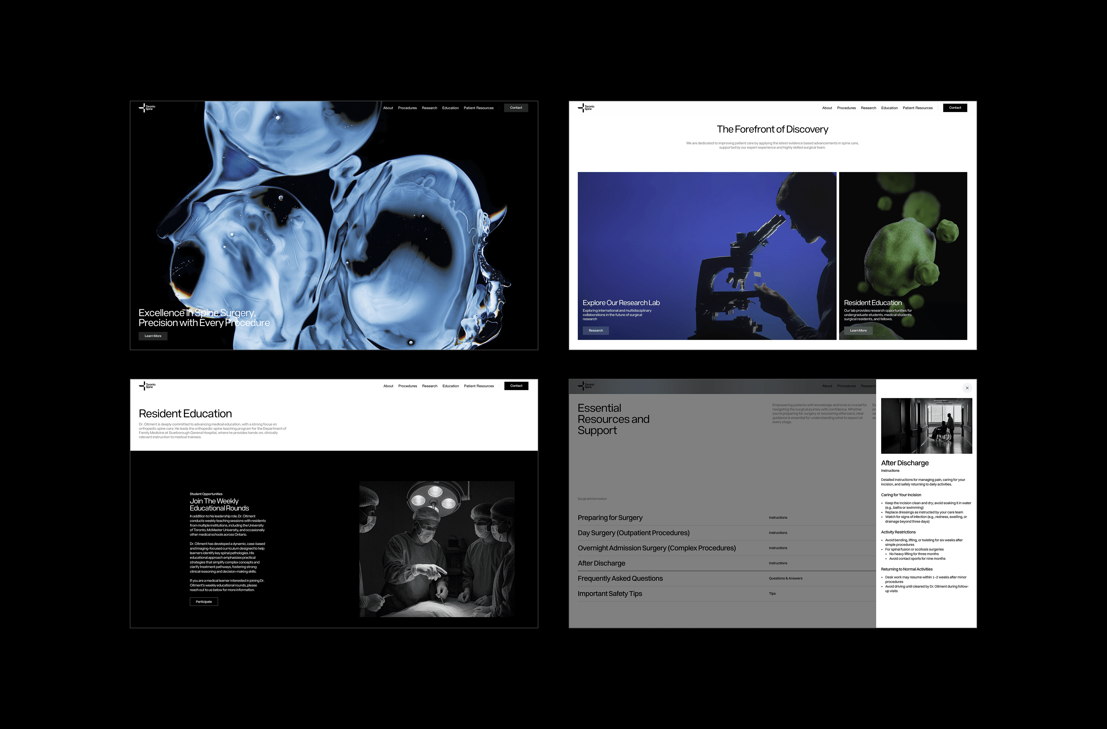
A complete brand identity was developed for Toronto Spine to reflect clarity, precision, and innovation in spinal care and research. The logo was designed as a geometric representation of the human spine, symbolizing structure, alignment, and medical expertise. The visual system combines vibrant, molecular-inspired colour imagery with black and white photography of human spines and skin. This contrast represents the relationship between scientific research at the microscopic level and the lived human body. The identity was applied across a conference landing page and supporting materials, creating a cohesive and credible visual presence for the Toronto Spine community.
A complete brand identity was developed for Toronto Spine to reflect clarity, precision, and innovation in spinal care and research. The logo was designed as a geometric representation of the human spine, symbolizing structure, alignment, and medical expertise. The visual system combines vibrant, molecular-inspired colour imagery with black and white photography of human spines and skin. This contrast represents the relationship between scientific research at the microscopic level and the lived human body. The identity was applied across a conference landing page and supporting materials, creating a cohesive and credible visual presence for the Toronto Spine community.